


|
Socoder -> Off Topic -> Codemasters'/2012 Olympics sucky logos |
|
| Mon, 04 Jun 2007, 09:10 | |
|
Jayenkai |
Press Release Codemasters says "The new Codemasters logo is bold and enigmatic and its introduction is a further milestone in the progress of the company. Much like our in-house talent, the new logo can flex its creative muscles. It doesn’t have a set colour; it may appear in a wide range of colour or tonal combinations. To that end, it’s a logo that always has an element of the maverick about it, which reinforces the creativity and playfulness of Codemasters as a whole." Jay says "The new Codemasters logo doesn't say CM, it says C3. It doesn't matter if it changes colour, since it still won't say CM. To that end, the logo sucks, which reinforces the idea that Codemasters creatively peaked about 10 years ago, when they did Colin McRae and Micro Machines V3." Go back to the Blue+Yellow circle. |edit| Or Mu... it's either C3 or Mu. I haven't decided yet.. |edit| -=-=- ''Load, Next List!'' |
| Mon, 04 Jun 2007, 09:22 | |
power mousey
|
Jay, I actually agree with you. True!  yet, the designer(s) of the logo actually turned the M on its side for a square shaped '3'. Yet, this is not only what was on their mind. Male plug and female inlet.  Also take a look at the shadow too. Snake like symbol...and with the weird head.  Obviously, to grab or draw your attention. Consciously and subconsciously. |
| Mon, 04 Jun 2007, 09:42 | |
|
Jayenkai |
Silly stupid challenge time! In honour of C3/MU's new silly incomprehensible logo, design a silly incomprehensible logo for your own .... um.. game/logo/company/thingum..  Quite obviously, that's the new JNK logo, which rather simplistically consists of the letters J,N and K randomly jumbled about in bizarre rotations. For extra effect, the logo is seen flying through a cityscape made up of other letters. -=-=- ''Load, Next List!'' |
| Mon, 04 Jun 2007, 10:21 | |
steve_ancell
|
CodeMasters are a load of crap anyway, just like their new logo. Codemasters don't appeal to me in any way, they turned their back on the indie programmers. They are nowhere near as appealing as they were during the eighties. And on top of all that, they've even thrown Dizzy into a dark corner of a dungeon and forgot that he was a big icon in their company. That's what happens when a games company goes international. |edit| I think they should hand Dizzy back over to the Oliver Twins @ Blitz Games. At least they would be able to make more use from the old egg. After all... It was Philip and Andrew that made CodeMasters biggest success. |edit| |
| Mon, 04 Jun 2007, 10:27 | |
|
Jayenkai |
AFAIK, the Oliver Twins do actually have the right to create Dizzy games. They just haven't figured out how to do one, yet. There was a Dizzy 3D movie on their website a couple of years back. Not sure what happened after that. -=-=- ''Load, Next List!'' |
| Mon, 04 Jun 2007, 10:31 | |
|
steve_ancell
|
I hope they do still have the rights to Dizzy, coz them Brothers is good .
|
| Mon, 04 Jun 2007, 10:34 | |
|
svrman |
hmm it looked like a "E" humping a "U" for a minute there. Didn't even recognise the "C". I'm not really a fan of CodeMasters. |edit| here's my WIP |edit| 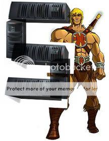
-=-=- BlitzRSS script back online! |
| Mon, 04 Jun 2007, 11:06 | |
flying_cucco
|
 Press Release: Let no one say that cuccos do not tessalate, redefining the term '69'. And it can turquiose, because that is a cool colour, and cuccos are cool. 
|
| Mon, 04 Jun 2007, 11:53 | |
JL235
|
Whenever I see the new Codemasters logo, for a second I think it's for E3.
|
| Mon, 04 Jun 2007, 13:15 | |
|
power mousey
|
heya flying cucco, your cucco's look so cooooooooooool. are they cucco for coca puffs? how about the tessalating '69' cuccos. in other words, animated and gyrotating cuccos. cheers  |
| Mon, 04 Jun 2007, 15:06 | |
|
mole |
Behold, my new logo of a MOLE with MOLE written in an obscure overlapping fashion! To show off my creative power, the mole can actually be ANY animal! Oh yeah and there is a green dot i forgot to erase.. i mean it adds depth. |
| Mon, 04 Jun 2007, 15:17 | |
|
Jayenkai |
<stupid>the green dot looks like poo!</dumb>
-=-=- ''Load, Next List!'' |
| Mon, 04 Jun 2007, 20:07 | |
|
garand |
.png)
|
| Mon, 04 Jun 2007, 20:20 | |
|
JL235
|
Speaking of crappy logos, here is the new logo for the 2012 London Olympics. It cost £400,000, and it looks like a woman bending down to give her male friend a 'helping hand'.
|
| Mon, 04 Jun 2007, 20:30 | |
|
garand |
OMG IT DOES !
|
| Mon, 04 Jun 2007, 20:49 | |
Stealth
|
I'll be the first to say I like there new logo. Maybe it's not perfect but its a nice professional logo. Unlike the girl giving a guy a fun time up there on the Olympics logo.
-=-=- Quit posting and try Google. |
| Mon, 04 Jun 2007, 22:24 | |
|
JL235
|
I do agree with Stealth, the CodeMaster's logo is nice. The only problem is that it doesn't look like it's for their company. Reminds me of the old Mars Mini adverts which were too small to have their own logo. They had stuff like 'Mars-Mini, the Worlds greatest airline'. Also on TV the Olympic logo is animated and shakes. She must be very rough. |
| Tue, 05 Jun 2007, 04:08 | |
|
steve_ancell
|
@ Diablo... It cost £400,000, and it looks like a woman bending down to give her male friend a 'helping hand'. It cost £400,000, and it looks like a woman bending down to give her male friend a 'helping hand'. ROFL...... It looks like the male friend was one of the designers at the Audi Motor Group, he must have got quite exited coz he's added another circle to the Audi logo and stuck it to her forehead .
|
| Tue, 05 Jun 2007, 15:52 | |
|
Jayenkai |
How NOT to design a logo. Step 1 : Make it incomprehensibly unlikable. Step 2 : Animate it in such a way that it gives people epileptic seizures. -=-=- ''Load, Next List!'' |
|
|
| |||||
|
| ||||||