

|
Socoder -> On Topic -> A welcoming screen for the uninitiated |
|
| Sat, 25 Jul 2009, 15:57 | |
Phoenix
|
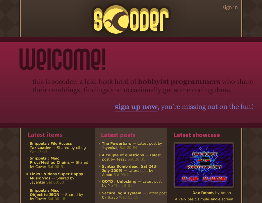 Sat down and tried to come up with a new idea for a SoCoder theme for fun, and to illustrate an idea I've had for a while. This idea was further reinforced when I saw the massive bounce rate SoCoder has, according to the Google Analytics statistics. The basic idea is that people who have never visited the site before will quickly be invited to take part in the community, as opposed to being greeted with the current semi-scary layout. The greeting page has a completely different structure compared to the "real" site, where the posts are placed in sidebars as usual. Its purpose is to give people a glimpse of the goodies inside the candy box. Thoughts? |
| Sat, 25 Jul 2009, 16:05 | |
Afr0
|
Isn't this what Jay tried to do some months ago? I rememember mentioning it to him in the MudChat, and he said he was pissed off at people not 'doing anything'... -=-=- Afr0 Games Project Dollhouse on Github - Please fork! |
| Sat, 25 Jul 2009, 17:15 | |
|
Jayenkai |
No, my main complaint was that it's all too texty, and "the uninitiated" are scared by the textyness. Much like DD's recent attempt at a new frontpage, you appear to have inexplicable decreased the "Nice Picture" vs "Ugly Text" ratio. I've actually been meaning to make the 1-sidebar, top-menu layout thing for ages, but as per usual, I've gone and started something else, AGAIN! I'll give it a bit of a trial tomorrow, and see how it goes. Essentially, with only 1 sidebar, there's so much less scary text, and everything looks a wee bit neater. (hopefully) Still, the banner's text is nice, and the background's also pretty good, too... I've also got that other orange-grid theme thing you did ages ago that I was keeping for "New Socoder".. .. To be fair, that's probably not happening, at this rate.. So, I could at least pop those two into regular themes, and see what happens there. Just one thing, though.. That logo looks really really bad!! I think it's the contrast between the circular (oC), and the elliptical font. -=-=- ''Load, Next List!'' |
| Sat, 25 Jul 2009, 17:20 | |
|
Hotshot |
LOOKING very good and keep it up 
|
| Sat, 25 Jul 2009, 17:40 | |
|
Phoenix
|
I'm sorry for not being more clear. What I really wanted to get through was the purple box in the middle; something to catch the attention of visitors. Ignore the design at the moment.
|
| Sat, 25 Jul 2009, 17:50 | |
|
Jayenkai |
Oh, right.. Yeah, I like the idea of that, although probably without the need to be that big! I'll play with the idea! -=-=- ''Load, Next List!'' |
| Sun, 26 Jul 2009, 19:08 | |
|
mindstorm8191 |
I don't know Jay, I think the current site layout provides a lot of information about the community, and indirectly shows that the community is active.
-=-=- Vesuvius web game |
| Sun, 26 Jul 2009, 21:51 | |
JL235
|
I REALLY like Phoenix's design, but I wonder if the middle Welcome box should be squashed a little. You don't want a welcome sign taking up most of the screen space.
|
| Mon, 27 Jul 2009, 06:27 | |
|
Phoenix
|
Perhaps there should be a small close button in the corner? Then it can still be that big and not cover all of the content which shows that the community is active.
|
|
|
| |||
|
| ||||